1. Real-time Tab Syncing between devices
It has SO many potential applications, it blows my mind. If you’re a web designer and would like to check out how your website appears on a cell phone, for instance, having a website seen from some other platform is invaluable. It matters greatly whether the connection is made by Bluetooth, Wi-Fi, or by syncing profiles. It also implies that, barring a few exceptions, you may share your screens across the gadgets.
2. Docks
Many of us could find this appealing. I mean… While side panels are commonplace in modern applications (e.g., Opera, Vivaldi, Brave), the aesthetics of a dock may also have a significant impact on the user experience. In addition to tabs, we have the option of incorporating many “sub-windows.” In my opinion, this is a basic improvement that might vastly improve the aesthetics of online browsers, but it has not yet been incorporated by the leading browsers. Icons for things like favorites, preferences, “pinned web applications,” and so on are possible.
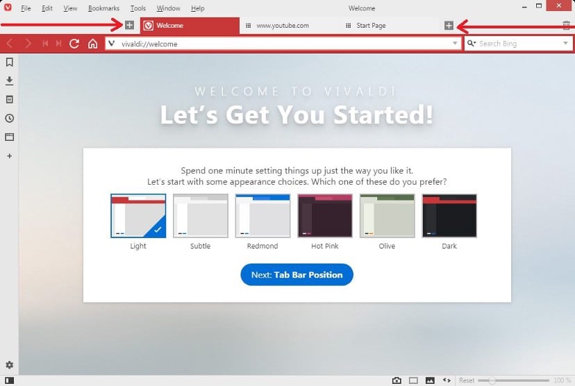
3. Align Tabs To the Center
Seeing tabs always off to the side is annoying, and I believe that there must be a choice to align them in the center. It has the potential to significantly alter the user’s interface, experience, and process. With tabs in the center, “tab groups” may be found on the left, and window controls on the right. It improves the browsing experience overall.
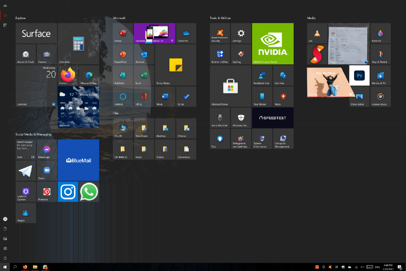
4. A Dashboard
I keep the very best for last. Envision a browser menu that, like Windows 8’s start screen, launches a simple shortcut that can display or do any operation. Everything from selecting documents to download in your browser to altering the look of your interface to doing research. I mean… It is possible to do this using a web browser’s home screen, however, it is far simpler to do it by using a shortcut while the current tab remains active in the backdrop.


